
This post looks at macro statistics relevant to the title question: How much is the efficiency of the existing housing stock improving? To put the question another way: Can we detect a signal of increased residential energy efficiency in the noise of other factors that affect total residential energy use?
Residential buildings currently account for roughly 1/5 of Massachusetts carbon emissions. By efficiency, we mean generally the amount of energy needed to heat, cool, and operate buildings (regardless of whether the energy comes from a fossil or green source). There are two parts of decarbonization — using less energy, and converting from fossil to green sources of energy. This post is focused on energy use as opposed to energy source.
First, a look at green house gas emissions from the residential sector — the ultimate metric that we seek to decrease. Green house gas emissions from the residential sector derive from the burning of fossil fuels in homes — mostly for space heating, secondarily for water heating, additionally for other uses like cooking and clothes drying.
Chart 1: Annual household site end-use consumption of fossil fuels in the Northeast region of the United States in 2020 (shares of total BTUs)
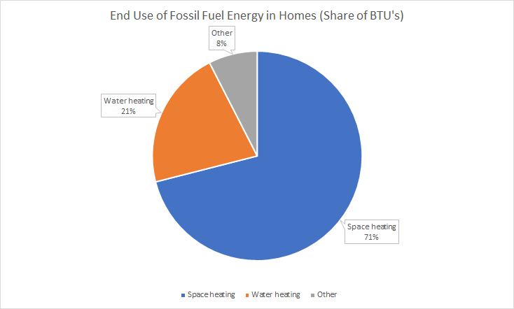
Source: Residential Energy Consumption Survey 2020, Table CE4.2. All categories in the chart above exclude electricity. In the Northeast region of the U.S. in 2020, electricity accounted for 31% of onsite energy consumption in households — only 7% of space heating and only 17% of water heating, but 82% of other uses.
The sharpest drops in residential emissions occurred in the 1970s after the oil price shocks of 1973. Emissions dropped further in the early 2000s. Since 2009, regression suggests a further downtrend of 0.7% per year.
Chart 2: Residential Greenhouse Gas Emissions in Massachusetts: 1960 – 2021
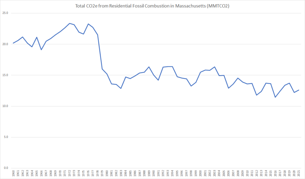
Source: This computation of emissions is based on the Energy Information Administration’s State Energy Use Profile for Massachusetts combined with EIA emissions ratios for fuel types. For the period after 1990, for which the state of Massachusetts has produced an inventory of greenhouse gas emissions, the computation shown above is, on average, within 0.8% of the CO2 line in the that official Massachusetts inventory. Several wrinkles bear mention: (1) The official Massachusetts inventory runs an additional 1-2% higher than this computation, due to the inclusion of trace non-carbon-dioxide GHGs. (2) Supplemental gaseous fuels (petroleum products, mostly synthetic gas, injected into natural gas) are double counted in the graph above. In the early 80s, synthetic gas use was significant and the double counting amounted to an overstatement of residential emissions annually of approximately 0.5MMTCO2. The overstatement declined to near zero through the 80s. (3) EoER reported consumption different numbers for the period 1978 to 1984 in its 1987 strategy analysis, including notably higher numbers for “oil”, apparently meaning all petroleum liquids. There are no notes in either EIA or EOER publications to explain the discrepancy. We choose to rely above on the consistently presented EIA time series which EoEEA now relies on. See attached spreadsheet for additional details. 2022 data are expected in early 2024.
Some of the drop in emissions has been due to fuel mix change — shifting from coal and oil to natural gas, with the biggest shift again occurring in the late 70s and a leveling off over the past 15 years. Combustion of natural gas yields less CO2 per unit energy produced — 45% less than coal and 71% less than oil according to the EIA (these combustion CO2 yields do not include the non-combustion global warming impact of gas leaks).
Chart 3: Mix of Massachusetts Residential Fossil Fuel consumption (Share of BTUs from each fuel type): 1960 – 2021
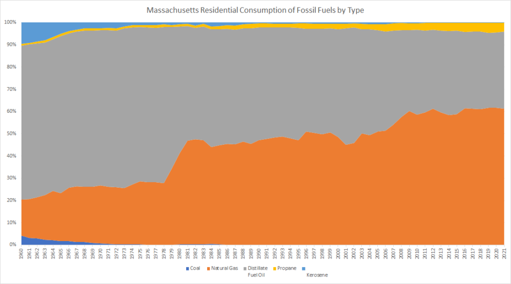
Source: Energy Information Administration State Energy Use Profile for Massachusetts. See notes to previous chart re double counting between oil and natural gas in early 80s.
It does appear that there has been some actual decline in energy use consistent with improving efficiency. The lowest level was reached following the 70s price shocks, with total energy use and fossil energy use both fluctuating but trending roughly level since then. Note that in this chart, the Renewables line is mostly wood and wood products until the last 10 years. Recently, solar has risen to roughly half of the Renewables energy production.
Chart 4: Massachusetts Residential Energy Consumption (TeraBTUs): 1960-2021
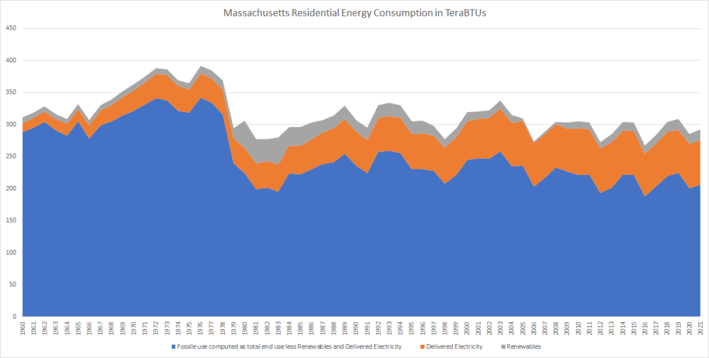
Source: Energy Information Administration State Energy Use Profile for Massachusetts. Fossil use is computed as total end use less other uses to capture adjustments for double counting between natural gas and petroleum categories. The double counting issue noted as to Chart 2 inflates use by approximately 10 terabtu in the early 80s and probably the late 70s.
The leveling off of total residential energy use shown in Chart 3 is something of an accomplishment since population has grown steadily over the same period.
Chart 5: Population of Massachusetts: 1960-2021
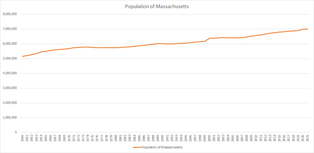
Source: Massachusetts Population 1900-2022 from www.macrotrends.net. Retrieved 2023-06-22; spot checked against underlying Census data. This convenient time series includes the entire population whether residing in households or in group quarters like dormitories, prisons, or nursing homes. Technically, only the household population is relevant to this comparison because our energy data sources exclude group quarters from the Residential sector. Group quarters are approximately 3-4% of the total population.
When population is taken into account, residential energy use does show a continuing downward trend, especially fossil energy use.
Chart 6: Massachusetts Residential Energy Use Per Capita (MMBTU per person): 1960-2021
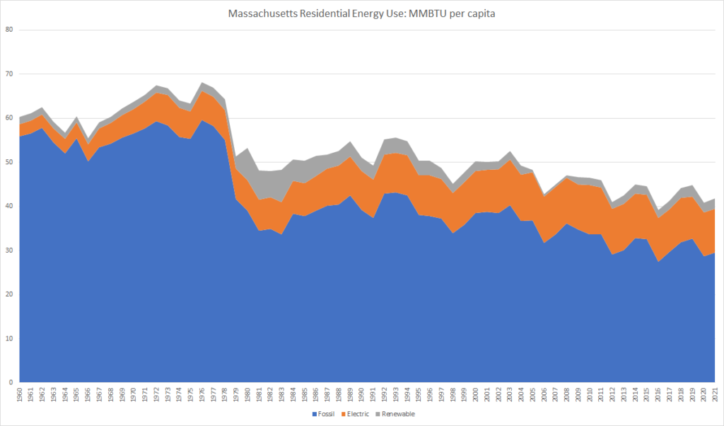
Sources: computation from sources in charts 3 and 4; same notes apply.
In addition to growing in population, we have been spreading out in two ways: (1) Fewer people are living in each housing unit — down from 3.3 persons per unit in 1961 to 2.5 in 2021. (2) As discussed in this post, we have been building larger housing units, driving the average unit size up from 1,368 square feet in 1961 to 1,513 in 2021. Both trends drive energy use above population growth.
Consuming more housing per person in Massachusetts, 1961 to 2021 — Persons per unit down (blue line) and square footage per unit up (orange bars)
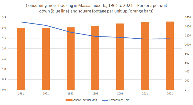
Source: See attached resource spreadsheet.
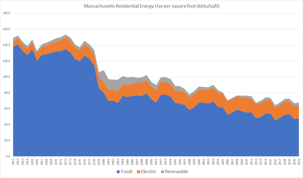
From the perspective of measuring energy efficiency per se, total energy per total square foot is a better metric that total energy per capita because it factors in the growth in unit size and reduction in people per unit. We will call this metric “Energy Use Intensity” or “EUI”. EUI does show a decline, dramatic in the 1970s and 1980s and more modest recently — approximately 0.8% per year (still statistically significant, p<.05) continuing through the last decade.
Massachusetts Residential EUI — energy Use per square foot (kbtu/sqft): 1961-2021
Our title question was: How much is the efficiency of the existing housing stock improving? We do know that while new homes may be getting larger, they are also getting more energy efficient. Code updates and building practice improvements have increased energy efficiency of new construction — see the chart below, which comes from the Building Sector Technical Report developed to support the Commonwealth’s Clean Energy and Climate Plan.
Chart 12: Energy Use Intensity by age of single family home in Massachusetts (from Building Sector Technical Report)
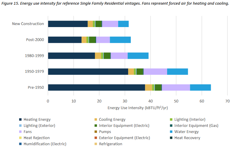
Source: Building Sector Technical Report, Figure 15.
To measure energy efficiency improvements of the existing housing stock, we need to back out the improvement due to improving standards for new construction. The chart below compares the actual energy per square foot (blue line) to the predictions of a crude model (orange line) based on the EUI estimates for housing from different construction periods shown above. The orange line represents predicted aggregate EUI based on the yearly mix of built square footage from different construction vintages. The orange line is fairly flat because new construction is only a small part of our total housing base — the housing mix does not change rapidly over time.
The BSTR estimates were calibrated to utility energy consumption data late in the last decade. If the BSTR estimates were perfectly calibrated to 2017 total energy consumption, the blue and orange lines would touch in that year. They do not touch — one does not expect micro estimates to reconcile perfectly to macro totals. However, they are in the same ballpark for 2017. What is striking is how far apart the lines are in earlier years: EUI in the 60s and 70s was over twice what the BSTR EUI’s would predict. Flipping the statement, the BSTR estimate for the EUI of pre-1950 housing, calibrated for approximately 2017, is less than half the true value for when the housing was built. In other words, the average performance of older housing in Massachusetts is much better now than when it was originally built (reflecting decades of investment in energy efficiency — more to come on the energy investments of the 70s and 80s in a later post).
Chart 13: Efficiency improvement of older housing in Massachusetts — actual residential sector EUI (blue) vs predicted residential sector EUI based on 2017 EUI of homes classified by construction date (orange).
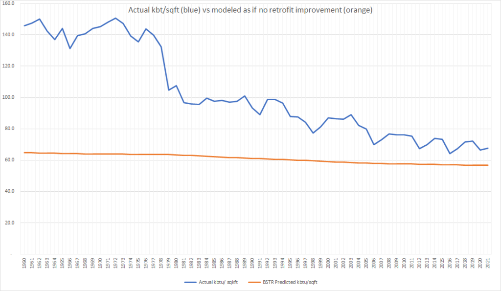
See the kbtu-sqft-year tab in the attached spreadsheet for details of this calculation.
Zooming in on the years since 2009 when we framed our emissions accounting, the relationship between the two lines above is not obvious from inspection: It is not visually clear in the chart above whether or not the decline in EUI due to new construction is enough to explain the overall decline in EUI — the lines are close to parallel but not quite, suggesting that new construction explains some but not all of the EUI change.
To get the finest view we can with the data we have, we test a linear regression as follows. The variable to be predicted is the difference between the actual EUI and the EUI based on construction vintage mix. The independent variables are time (allowing detection of progress over time in energy efficiency) and heating degree days at Logan airport. Heating degree days vary from year to year and fuel needs depend roughly linearly on heating degree days.
The model reflecting just the last 13 years is not statistically significant but the regression coefficients do have the right signs — positive coefficient for colder winters; negative coefficient for time, suggesting (but not proving) recent overall progress on EUI in existing homes. If we expand the time line to the 22 observation periods 2000 through 2021, the decline is visually evident and we do get a statistically significant regression as shown below.
Chart 14: Difference between actual and construction-vintage-predicted EUI between 2000 and 2021. Raw value is blue line, weather/time smoothed value is orange.
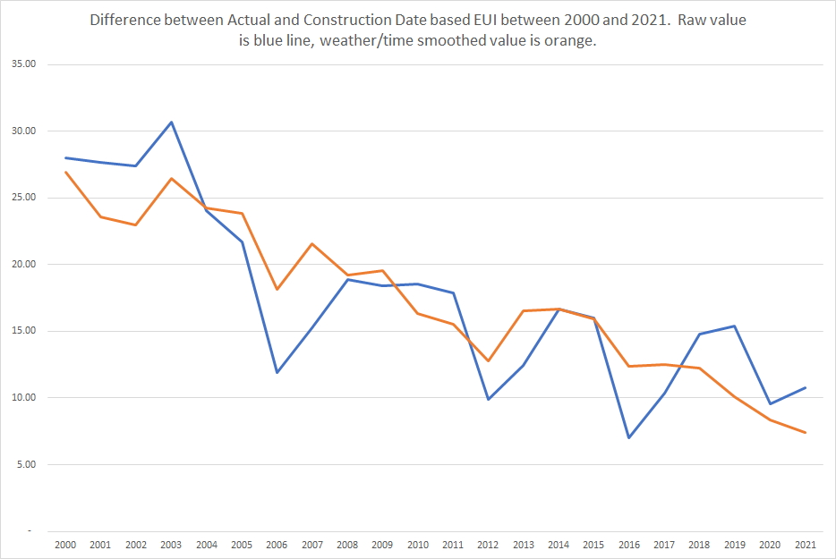
Note: The 22-observation regression shown is overall statistically significant (F-test) at the p<<.0001 level; the difference between zero and the negative coefficient for time is statistically significant at the p<.0001 level (two sided t-test). Note that over the past 22 years, the average annual decline in annual heating degree days at Logan (base 65) is 0.5% with 95% confidence interval 0.1% to 0.8%, perhaps reflecting climate change. All detail is in the attached spreadsheet.
The slope term in this regression suggests an average statewide improvement of efficiency of existing housing of approximately 1.0% over the past 21 years — taking the slope of the regression line for the difference as a percentage of the average overall EUI during the period. The 95% confidence range for this estimate is 0.6% to 1.3%. This estimate may be overstated because the newest construction in many communities meets higher efficiency standards than assumed in the BSTR. However, this effect should be negligible because the average EUI from our vintage-based model is dominated by the existing base: The predicted overall EUI decline due to new construction in that model is only a total of 2.4 kbtu/sqft from 2000 to 2021; if one varies downward the EUI of all new construction by 1/3 as of 2000, the decline becomes 3.5 kbtu/sqft — an improvement of only 1.1 kbtu/sqft.
Summary of discussion
We started with the question: Can we detect a signal of increased energy efficiency for existing buildings in the noise of other factors that affect total residential energy use? The answer appears to be yes. Chart 13 shows that over the 40 years from 1970 to 2010, fossil energy intensity of housing in Massachusetts dropped by roughly half, even factoring out new construction and even after the rebound from the temporary drop likely due to thermostat cuts following the oil price shock of the 70s. Focusing narrowly on the past couple of decades, regression analysis supports the proposition that existing housing improvements have occurred at a rate something like 1.0% per year.
Questions for further investigation include:
- How did the price-shock drive such large cuts in energy use in the late 70s?
- What drove the continuing long term decline through the 90s and 00s?
- How does the current estimated pace of 1.0% per year compare to Mass Save estimated savings from energy efficiency measures each year?
- What does the apparent efficiency progress made in the 70s, 80s, and 90s say about the opportunities for further progress?