
The map, chart and table below are an interactive view of real-time data for MBTA buses that you may use to explore the recent performance of various bus routes. Further explanation may be found at the bottom of the page.
The real-time data published by the MBTA offers us an opportunity to answer questions about bus performance using our own methods and tools. The first question is: what to measure? We believe that the metric selected should reflect the experience of bus riders as directly as possible: because the bus system exists first and foremost to serve people. Now, we all probably have an idea of what using the bus system feels like, but how do we put that into terms that can be quantified and analyzed? We have selected a metric that we believe will best capture the experience of a typical bus rider: it is called “Weighted Real Headway”. The idea is to use the real-time positional data published by the MBTA to figure out how the average rider perceives the gaps between bus arrivals at selected bus stops.
Frequent bus service is usually scheduled to arrive at predetermined intervals, also known as “headways”. For example, the Route 71 bus is scheduled to arrive at bus stops every 10 minutes during the morning rush hours. Bus riders expect to be able to walk up to any bus stop along the route and experience no more than a 10 minute gap between bus arrivals. Now, we could use the real-time data to find out how many buses arrive in the span of an hour. But, suppose all 6 buses show up within the course of 10 minutes, and then leave over a 50 minute gap in service before the next bus arrives. That would be unacceptable to riders, but it would be rated a perfect score if you only used “Average Headway” as a metric. That’s because 60 minutes divided by 6 buses still results in “10 minutes” as an average headway, even if they are distributed in such a skewed manner. Clearly, that is not a useful metric.
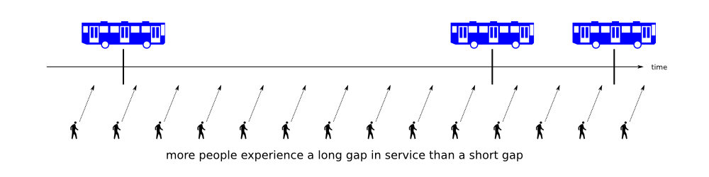
Instead, we want to give weight to the fact that all of the riders who show up during such a 50 minute gap are experiencing terrible service in that instance. So, the “Weight” in “Weighted Real Headway” refers to the number of bus riders who experience a given gap. The longer the gap, the more bus riders will show up, and therefore the heavier the weight. Thus, if the 71 bus has a 50 minute gap in service, that worsens the “Weighted Real Headway” considerably more than a set of closely-bunched buses helps it.
This is a good metric for quantifying the negative effects of bus bunching on the typical rider experience. Therefore, we use it to “score” the performance of various bus routes during stretches of real time, every day. The score is the ratio of the “Scheduled Headway” to the “Weighted Real Headway”, expressed as a percentage. A score of 100% means that the buses have largely been able to maintain their scheduled gaps during that period of time. A score less than 100% means that there was a longer than desired gap in service between bus arrivals. It is possible to have a score greater than 100%, which means that the buses arrived more often than strictly necessary and did not have a bad gap.
The map, chart and table above all work together to display this information. The map shows the bus stop locations that were analyzed. Specific time periods with regular service were selected for each bus route by examining the published schedule. The time periods have been split into three categories for clarity: morning, afternoon and evening. You can click on a time period and then select one or more bus stops by clicking on the map markers. Once you do that, a chart will pop up and show you the performance of those buses over the past 30 days (weekends and holidays excluded). Each point on the chart represents a single day’s measurements: you can click on the points for more information. The lines drawn horizontally across the chart represent the average score of all the points.
Below the chart is a table that contains most of the same information, but in textual format. The table starts off showing all of the data: but as you make selections above, it focuses more narrowly on your choices. You may sort the table by clicking on the header of each of the columns: the first click sorts by increasing order, the second click sorts by decreasing order. You may also retrieve a log of bus arrivals by clicking on a particular row of the table: that will list for you the bus arrivals during that time period so that you may see the source of the numbers used for the score.
Please explore and let us know about any questions or comments.
Disclaimer: This tool is experimental and for informational use only. Please bear with us. Also note that it is possible for bus information to be missing from the MBTA real-time data feed, and although the occurrence of that is rare, it may explain certain gaps. We have made an attempt to discard as much bad or corrupt data as we have been able to detect.
Update: If you revisit this page and the data appears to be old, try using the Reload button on your browser to refresh it.
Matt, thanks so much for putting this together. I think the metric you have developed for measuring the real delay experience of riders is very helpful.
This is fabulous! I think the weighted average is a useful metric, and something the MBTA should be held accountable for.
Another variable with rider’s experience is the overall time to destination. (eg. from Waverly to Harvard) This provides users with comparative info in their commute–how much longer does it take me to get somewhere if I bike, drive or take the bus? Ultimately, this might be good data for looking a congestion pricing for drivers as a way to reduce traffic during peak periods.
I am not sure how involved it would be but I would like the 62, 76, 350 and 351 added ONLY if it is a simple addition to the task. These are the routes I use.
Edward, have you looked into walking? I’m assuming you’re taking one of 35[01] and 62/76 inbound and the other back outbound. These routes aren’t more than five or six miles apart at their extremities I think.
I only mention it cause I was taking the 71 and redline to reach the 350 for years without realizing the average time there wasn’t much shorter than walking it (and the worst case way worse and unpredictable). You might accuse me of trying to free up a seat on the 350 here, I guess ;), but seriously, it’s really nice to start the day with an hour or so of walking. Much better than being on a bus. I catch fewer colds too.
Thank you for sharing this information. I’m curious about the 71, 72, 74 and 78. I use the apps “Catch the Bus” and open mbta. During the week they are very helpful. One problem I have encountered is that on Sundays two bus lines are combined, the 72/75 runs from Belmont Center to Harvard Square. There is some kind of problem with the software, such that I am never able to use the bus locating apps; maybe they don’t know how to assign the bus? Sunday is also when there is the least service, only one bus every 40 minutes, so it would be especially helpful to locate that one bus. Maybe this Sunday bus needs its own number for the software to work? You seem to be deep into how the data works, so please let me know if you can think of a solution. Thank you.
This is REALLY helpful, Matthew!
I know the stock MBTA feed only reports bus times and positions, but what would make this exceptionally useful would be to add rider count. Does MBTA provide this data in any form?
With rider counts we could analyze crowding (another pain point!) as well as determine which runs might provide a seat, thus effecting, perhaps, a shift in ridership to smooth out the crowds.
Again, great work on this.
Wonderful work, probably hard to do too.
Suggest not using words like: “the buses have largely respected their scheduled gaps”. I suspect a significant cause of bunching is traffic, not dispatch. One would want MBTA management to report on the bunching caused by dispatch.
The weighting still reports pretty good bus service, or at least that is my interpretation.
What about a statistic that says, something like, during rush hours, when it really counts: the probability is 80% of the time the wait for a bus will be no longer than 5 minutes from its scheduled time. Can this be calculated.
Or better, 90% of the time, the actual time to destination will be no longer than 10 minutes over the scheduled time to destination.
In other words, give the rider three pieces of information: schedule, probable wait, probable time to destination.
Let’s focus on what we want: more predictable, faster, traffic light preferenced bus service. We are not planning to build more urban lanes. Watertown, Belmont, Arlington, Cambridge–The Alewife-Transportation-Community are experimenting with complete streets, some with fewer vehicle lanes.
Could the table be made narrower? The Ipad cuts off the last column at “Worst Real Head”.
This is a wonderful tool. It’s useful data and a nice visual representation of the data. Thanks for creating it. I hope the work will continue to identify meaningful data, share it and present it in understandable ways.
What a fantastic tool! Finally something that is quantifying some of the issues that some T riders experience. Now, if only we can find out the causes behind these delays to reduce them and find out viable solutions to avoid such gaps, the resulting build up of buses and crowding issues.
Thank you all for the kind words. I will try to address some of the comments and questions.
Kim, Arthur: We have been considering some other metrics and will post about them when and if they are ready. Another nice thing about weighted real headway, however, is that if bus travel time is delayed then that will also appear as a form of “bunching” overall and that will be measured as lengthened headways, degrading the score.
Edward, Michele: We would also like an analysis that works for less frequent routes such as the 62, 64, 72, 86, etc. Those buses do not fit into this particular tool because they are not scheduled at regular, frequent intervals. Instead, the riders of those buses are expected to examine schedules in order to use the buses. The current analysis shown in the tool above is meant for buses that you can simply “walk up” and wait for, expecting one to arrive in short order. I am working on an alternative for infrequent buses but it is not ready for publication yet.
Alan: I would love to have live ridership data but unfortunately that does not exist. When the MBTA collects ridership counts they do it by sending out technicians with clipboards to actually count people. They can also look at the automated fare collection data at the end of a shift by downloading statistics from the bus when it is parked at the depot. Published statistics in the Blue Books are a combination of these two efforts. But there is no protocol for sending out live counts of riders from buses over the airwaves. Personally, when using bus tracking apps, I tend to regard closely bunched buses as a potential sign of overcrowding. There is a close link between bus bunching and overcrowding because the latter causes a bus to go more slowly. It is highly likely that the “front bus” in a platoon of buses is overcrowded because it is delayed, and it is delayed because it is overcrowded. I hope that heuristic helps you a little bit.
Arthur: I have narrowed the table a little bit, but any more causes cells to get bunched up a bit. Let me know if that helps, though. Also, is it possible for you to use a “zoom out” function on your web browser? Unfortunately, I do not know the touch combination for that on the iPad. It might be enough to do the “pinching” motion that works for zooming on the Maps app.
Michele: Have you tried downloading other apps and testing them with the 72/75? I have the following installed on my Android device: “Transit”, “BostonBusMap”, “ProximiT”, and I also sometimes just point my mobile web browser at the NextBus.com website. It’s possible that one of those apps might work better for your needs.
Hi Matt,
This is useful, but I’m wondering why you elected to have the measurements start at 7:00 instead of earlier? My husband catches the 71 daily to get to Harvard, and for the last two days at around 6:30 a.m., there have been significant delays (upwards of 15 minutes). It would be interesting to see that experience reflected in the data as well for a more nuanced view. I’m sure the information gathered before and after rush hour would also help with the planned Fresh Pond traffic study.
*Rather yesterday (1/05) there was a 15 minute delay – this morning was less, but still noticeable.
Hi Maya,
The reporting periods were chosen for each route based on the published schedules, for periods of time where the bus arrived at consistent intervals. For example, the 71 bus begins a period of “Every 10 minutes or better” at just after 7 a.m. on the schedule. In fact, prior to 7 a.m. the 71 bus is scheduled to arrive at intervals of 6 to 9 minutes, but it is not consistent in the same way.
Nonetheless, I do find that period of inconsistent scheduled arrivals interesting and plan to address it in future analysis. I also find reports, such as the one you have provided here, useful, because I can compare the recorded data to actual experience. So I appreciate the anecdote.
For example, I can see that on Jan 5th the buses all appeared to be operating about 7 minutes behind schedule by 6 a.m. and at around the middle of the hour there seems to be a missing trip because there is a 16.5 minute gap at a time when there should be buses arriving every 7-8 minutes.
I think this is a fascinating study and it makes a lot of sense to me. I think you’re tackling this from the right direction.
I have long been frustrated with the MBTA “scorecard” (http://www.mbta.com/about_the_mbta/scorecard/). It comes out months too late and it doesn’t measure customer service. No one sitting in a broken down train says “wow, this had a really high number of miles before it failed!” They care about their service level, not the mean miles to failure.
I’ve been thinking about a “customer-minutes of inconvenience”metric for the Red Line. If it’s 1PM and the train stops at 3pm for 10 minutes at Alewife, that’s no big deal – a couple hundred minutes. But if there is a train stuck at Porter at 5:30pm for 45 minutes, and the whole line gets jammed up, that’s quickly going to be 10s of thousands of minutes. I think that a stat like that would be far more informative than what the MBTA is generating today.
Hi Dan,
Thanks. I have also been frustrated with the MBTA’s approach in the past towards measuring customer service. About a year ago I made extensive comments on the “weMove Massachusetts” plan that was supposed to introduce new performance metrics for planning transportation. That plan was also mostly characterized by metrics such as “mean miles before failure” that might be of interest to the maintenance department but have zero relevance to customers.
I don’t know how much my comments had an effect, but within the last year I have heard several different officials and MBTA staff-members use terms such as “weighted average headway” and “passenger-minutes” of time. So there is some hope.
The real-time data allows me to measure vehicle-minutes of delay, but I can only extrapolate passenger loads from the occasionally published surveys. I think you are right that it is fair to estimate that at 5:30pm the Red Line is operating close to crush loads, but off-peak it can be quite variable and difficult to predict.
Hope they use this for the Night Green weekend service. They should find generally, Bus Service has improved at least it has on 55!
Just wanted to say THANK YOU to Mr. Danish for this very important data. I am sure it was a lot of work to pull it together.
Tony
Last comment–When studies are done of congestion at intersections, how are commuters weighted? Do we count vehicles waiting or commuters waiting? Do we preference the 20 commuters in a bus at least equal to twenty single occupancy cars?
By doing this, do we consider preferencing the bus, allowing it to keep closer to its schedule, perhaps attracting more commuters to the bus, possibly making way for other cars, or, better, a faster commute for all?
While I cannot speak for every study, the vast majority of traffic studies that I have examined have only counted vehicles.
So under that approach, a bus with 20 people is counted as 1 vehicle, and even 2 passenger cars are considered to have more ‘weight’ than a single bus.
I don’t agree with this methodology but that is what we face, by and large, today.
So, skipping that kind of study (equal treatment for vehicles), we focus on commuters, mobility, and, first, preferencing buses toward their schedules. We ground this suggestion in the very calculations you have done.
The format fits my ipad, thanks.
Thanks for this, Matt! What was the basis for deciding which stops to include?
Also, the text mentions a ratio expressed as a % but I didn’t see that in the chart or tables.
If compared across the full population of stops,that score would give us a good way to prioritize stops or routes most-deserving of our attendion, no?
Hi Aaron,
Because I have decided to examine the gaps between bus arrivals, the precise stops selected aren’t so important, because they should all experience the same gaps, on average. One exception would be bus stops near the start of a trip, because the dispatcher may be more successful at managing departures close to the layover point. Therefore, all of the stops chosen are close to the middle of their respective routes, where the normal entropy of traffic and boarding delays has had some chance to take effect.
The ratio expressed as a % is the number that I am calling the “Score”, and it is on the far right side of the table. You might have to scroll to the right to see it. The purpose of this “Score” is to give a quick, one-glance estimation of bus performance that might be helpful for directing your attention to entries that could use further examination.
The Score is most useful for rating the performance of the entire route rather than individual stops. It is possible that particular intersections are causing severe problems for buses. However, once a gap has formed between bus arrivals, it has a tendency to propagate itself all along the entire route from end-to-end. That’s because the only way to fix it is to somehow speed up the bus behind the gap, or to introduce a new bus onto the route that fills the gap. Both methods have their individual downsides.
I hope that explanation has helped.
THIS IS GREAT. THANK YOU!
I added another feature just special for this winter. Now the web page will display a daily average for all routes when you do not have any bus stops selected, and also a 30-day average.
You don’t have to do anything to see this feature — it is the default view for the line chart.
If you click on the afternoon button then you will also see that February 6th was the worst afternoon rush for these buses this winter yet, scoring a daily average of 38.2% overall. Only the 71 bus managed anything near normal, scoring about 77%.
Personally, I managed to outwalk two 57 buses on my way home last night, so I’m not surprised.
This is very cool! Do you want to add the #86? The route from Brighton to Harvard Square is very heavily used and usually inadequate. Constantly being bumped and stepped on from overcrowding, and not enough frequency to accommodate Harvard’s work day crowd (travel hours 8-9am and 5-6pm).
Hello Susan,
I believe the reason the 86 was not included was because it operates relatively infrequently as compared to the rest of the routes that we chose. It would be difficult to get meaningful data from the 86. Perhaps Matthew Danish can fill us in.
Andrew Bettinelli
Legislative Aide
Office of State Senator William N. Brownsberger
Hi Susan,
Thank you. I do have a particular interest in including the 86 and the 64 buses, but they don’t quite fit into the same analysis scheme as the 57 and the 71, due to irregular frequency.
I may take another look at it though. The 86 is irregular, but may be close enough to regular during those hours to try and accommodate it. And I believe that it’s also important to see the perspective from the way people use the buses. Most riders of the 57 do not check a schedule before showing up at the bus stop, because it is frequent enough not to matter. There are some times that may be true for the 86 as well, in which case, this analysis applies.
Thank you! Given the increase of construction on Western Ave and the rapid rise of more Harvard buildings in North Allston, I think the 86 and perhaps the 64 will have to become more regular. Hopefully the MBTA will be able to respond the growing need. So maybe in the future they can be analyzed!
I just added several new collection points. After looking over the 86’s schedule again, I decided that there was a consistent period in the morning of buses arriving every-10-minutes on their way to Harvard and Sullivan. That collection point is marked at Washington Street and Market Street.
I also added three points for the Green Line “B” branch. One at Packard’s Corner, inbound, in the morning; one at Babcock Street outbound in the afternoon; and one at Babcock Street outbound in the evening. I have had the code for these working for a while but the reliability of the real-time GPS beacons was poor at first because not every train was equipped with one. I felt it was unfair to score the Green Line when I could easily walk outside and spot a train without a GPS transponder go by within 15-20 minutes. But now it seems that most every train has been outfitted with transponders.
In fact, it’s a little more subtle than that. The MBTA has chosen to outfit every Type 8 “low-floor” car with a GPS transponder, but not the Type 7 “high-floor” models. Due to a court settlement, every 2-car-or-more train is supposed to come with a Type 8 “low-floor” as part of the consist. And in my experience, that is the case for over 99% of the time. Therefore, almost every train should be part of the tracking.
However, sometimes the MBTA runs single-car trains, and sometimes those single cars are not the Type 8 model, even though that’s not supposed to happen according to the lawsuit settlement. Such a single-car Type 7 train would not be tracked by this system. But in my view, given the time periods analyzed, and given the crowding on the Green Line, a single-car train should hardly count as a trip anyway, since it will not be able to handle the passenger loads placed on it at all.
You might consider collecting data both ways–inbound and outbound–for the three times during the day.
Arriving at the Payson Road inbound stop at 4:55 PM on Friday the 11th, my wife and I waited over 35 minutes and watched 9 buses go towards the opposite way. That’s a new record for us, though from the comments you and Will have gathered, others may have us beat.
When I asked the driver what the problem was, she responded, “I have nothing to say.” (I failed to note the operator’s number.) We had time to think about her reply on the way to Harvard Square. It could have been the MBTA’s recommended response, so that bus drivers don’t get into heated exchanges with passengers. That’s fine, but if so, the MBTA as an organization needs a way to communicate with its riders. Or it could be that response is the way the driver as an individual normally addresses a stressful situation. That’s fine, too, though I might expect it to be uttered with a smile. In the circumstances, though, the response could readily be interpreted as dismissive of the question we asked. That’s not fine, and the MBTA might consider some sensitivity training.
I had understood from Will that things were looking up, but unfortunately not last Friday. Sorry.
Hi Bob,
Sounds like a bad day for bus bunching. In fact, even without showing statistics for both ways, you can pick out some information from the existing display. For example, I clicked on the Afternoon arrow for the Trapelo Rd @ Common Street bus stop, then selected December 11th in the table below it. You can then see the vehicle identifiers of the buses that passed Payson Rd going outbound between 16:58 and 17:16 that afternoon. I can see from the readout that there were quite a lot of buses that went by in a short period of time, matching the observations that you made. You can also see that there were large gaps in service on either side of the cluster. Since bus service is a loop, it is likely that one of those gaps happened to overlap with your time standing at the bus stop. Although none of the gaps shown is 35 minutes long, it is possible that something caused a bus to go out of service at the worst moment before it reached your bus stop on its way back inbound. I see that bus 0707 (the one that went outbound past you around 16:58) disappears from the remainder of the log file, although if it had remained in service it should have gone full circle before 18:30.
I don’t know what to make of the bus driver’s comment. I will say that bus bunching is something that can’t be helped by bus drivers, and even dispatchers have limited tools available at their disposal (all of these tools coming with the possibility of upsetting somebody waiting for or riding a bus). The best medicine against bus bunching is prevention, which is why I advocate for solutions that reduce unnecessary ‘friction’, e.g. by making it easier for passengers to get on and off buses. Using all of the doors, speeding up fare payment (or pre-payment), and having level boarding as far as possible. The benefits to passengers with disabilities are also tremendous. And for bus scheduling: signal priority at traffic lights, dedicated bus lanes, or bus queue-jump lanes where full dedicated lanes are not feasible, etc.
These kinds of improvements are not hard, are widely implemented in other places, are relatively cheap, and will save money in the long run. But it take political will to do.
Matthew
Just a quick note: I know that something is broken. However, the MBTA has decided to start publishing a real-time data analysis API that could be used to re-implement this tool using official sources, instead of collecting the data ourselves.
The bus data is currently not available using the data analysis API, but it should be soon. So I think I may wait until that happens and then redo the program to use the new API. Or perhaps there will be something more general available by then.