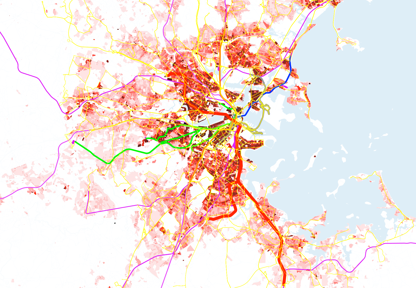
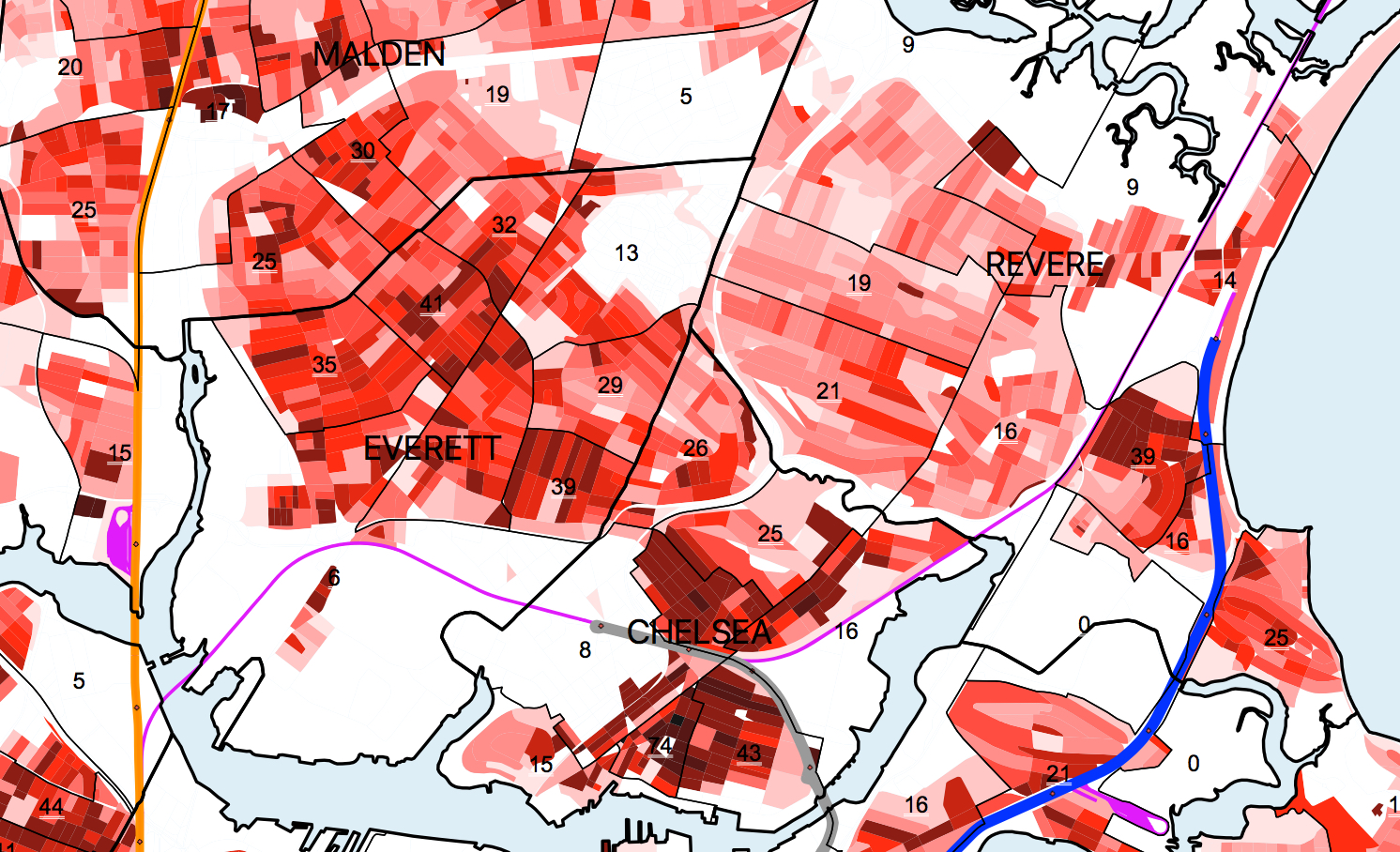
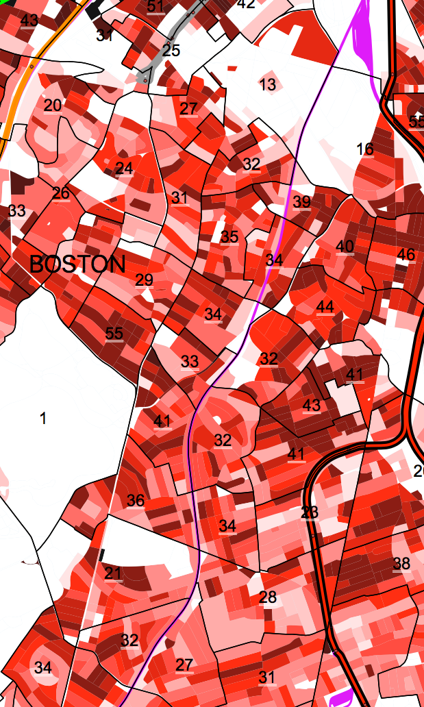
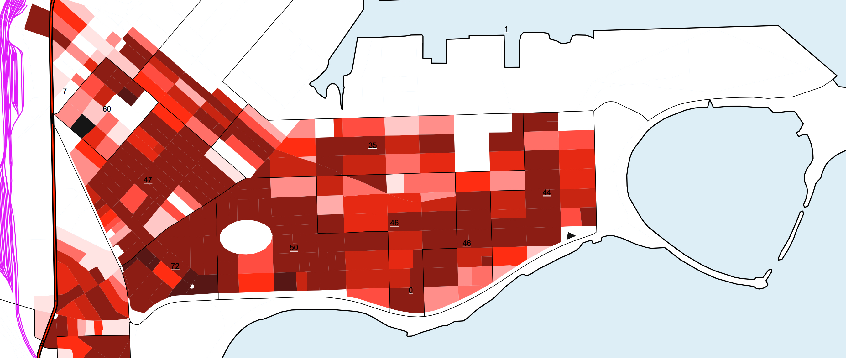
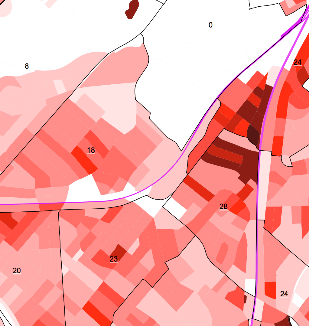
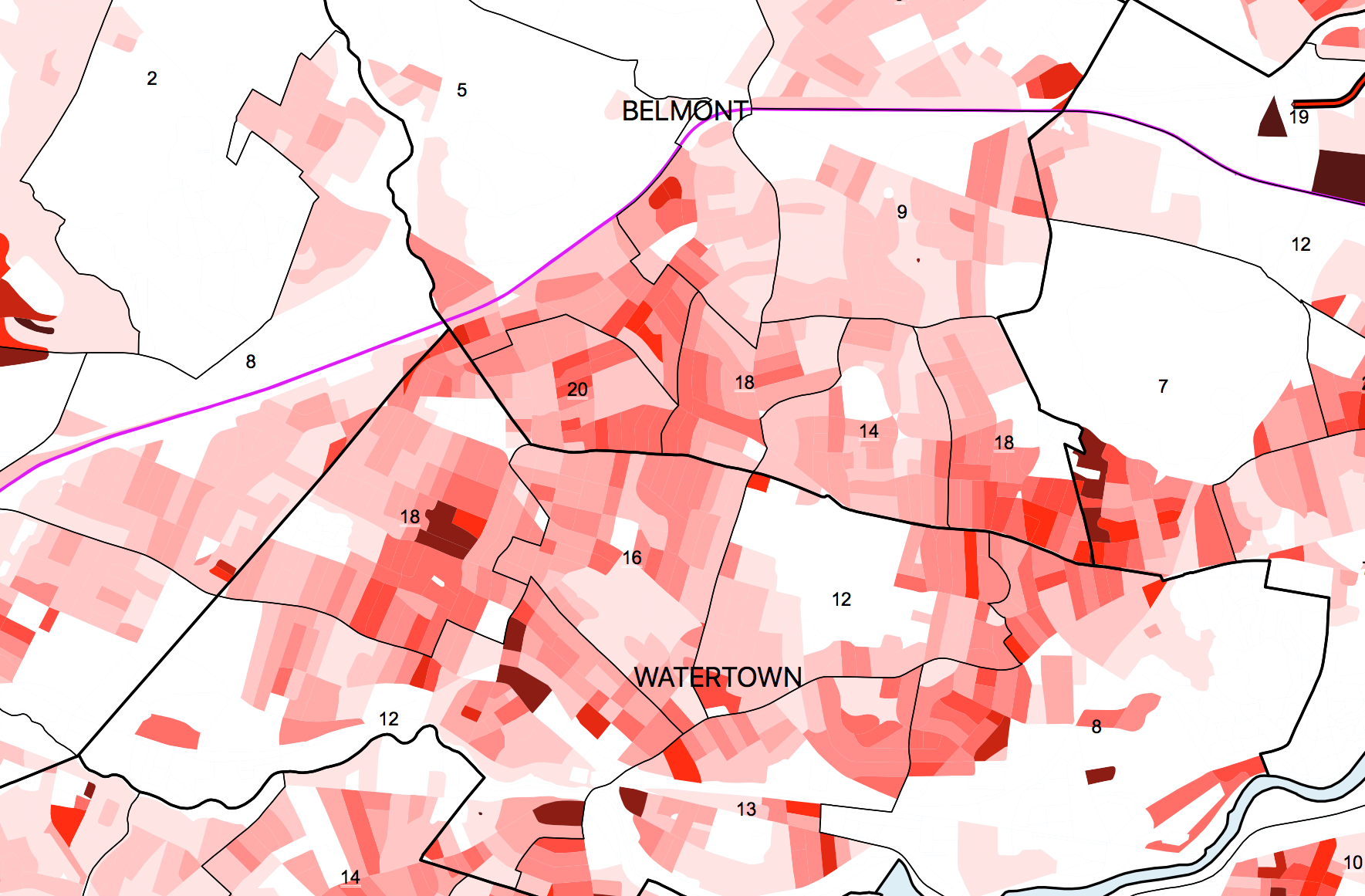
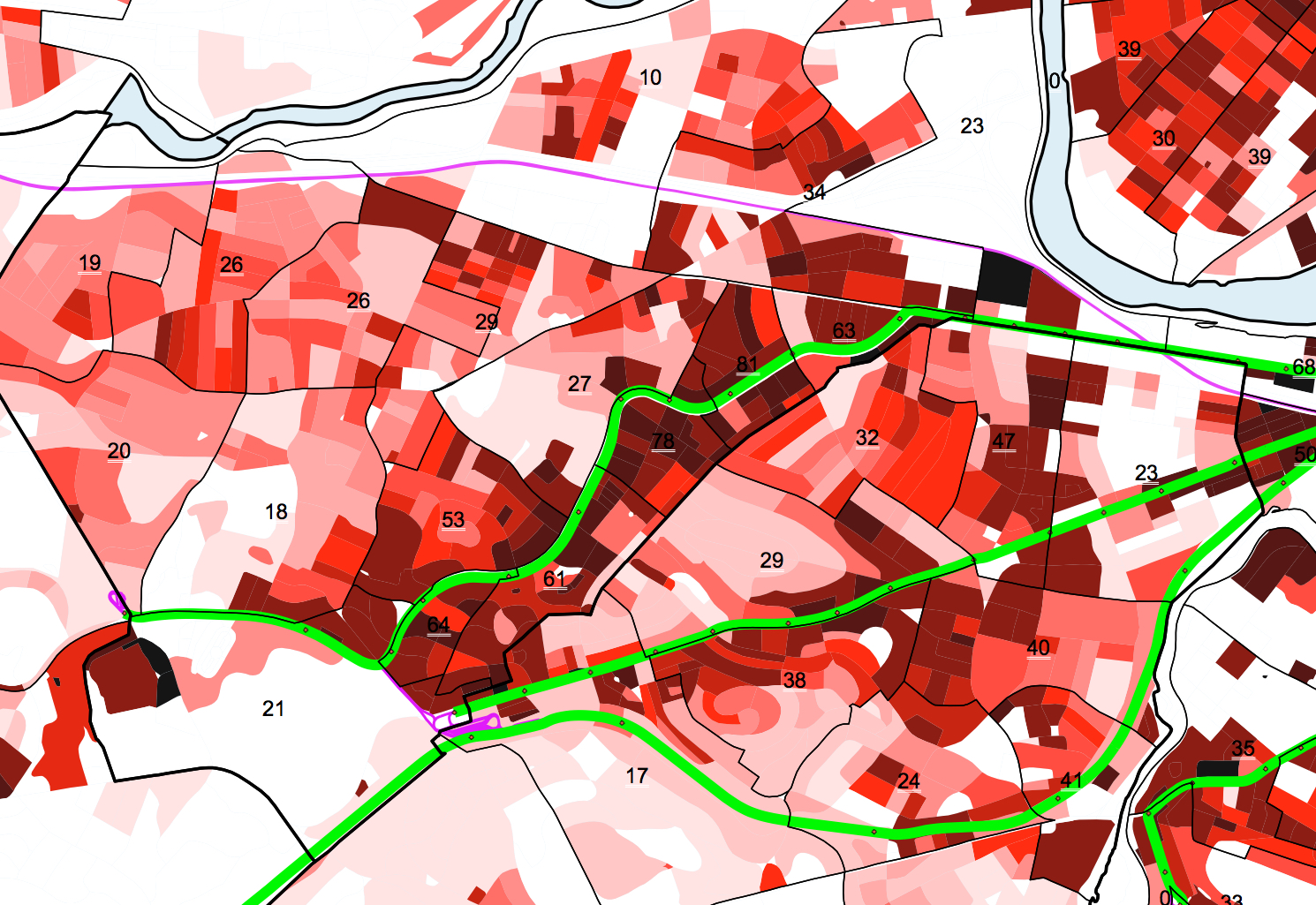
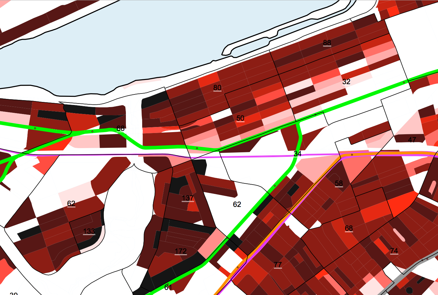
It’s difficult to determine actual population densities in the Priority Places charts in the MBTA Focus 40 document. I prepared the graphics below which show the actual density numbers by census tract. These are computed from data layers downloaded from MassGIS into Cartographica. Click to zoom!
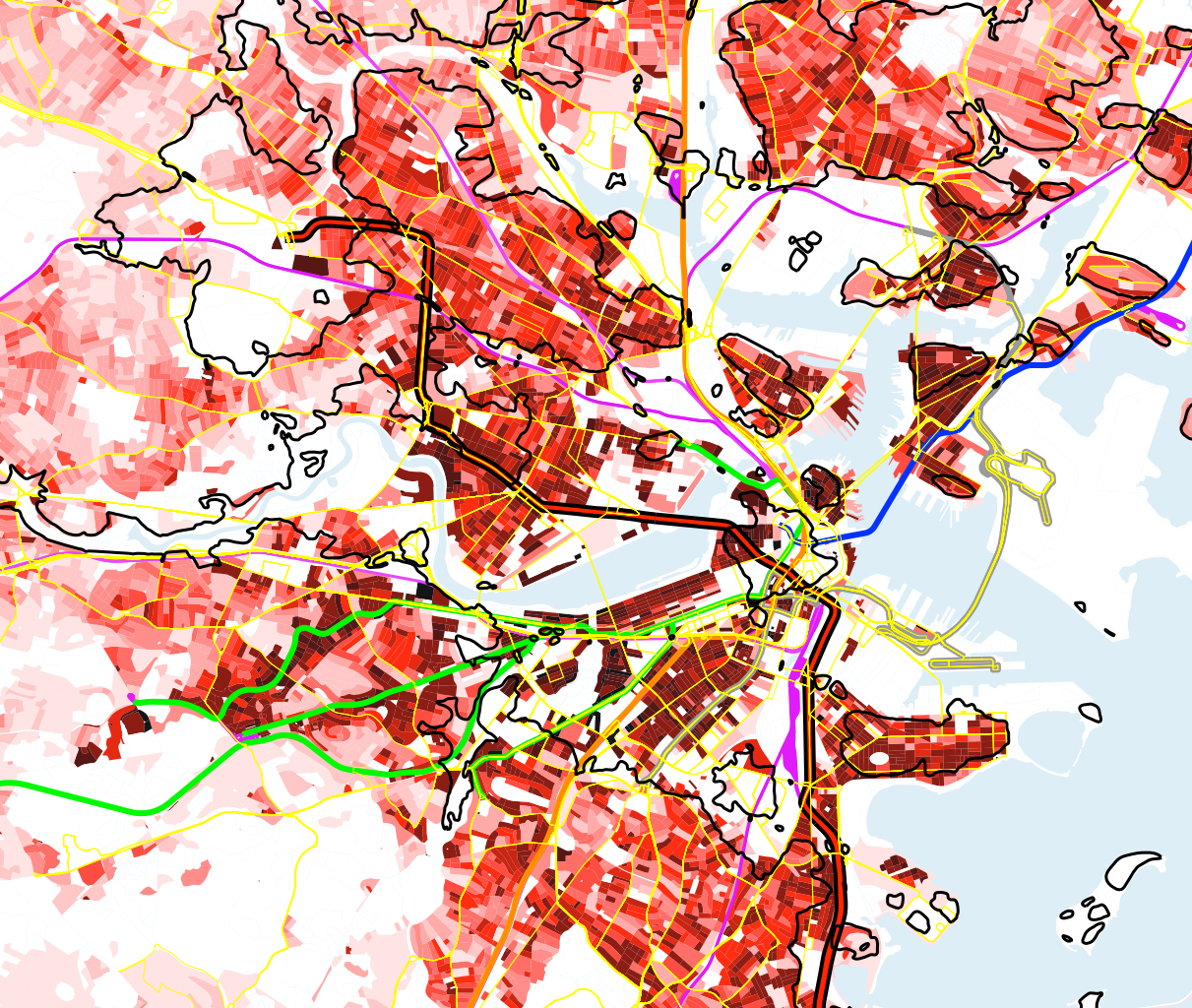
The color coding reflects 2010 population/acre at the census block group level and runs from least dense (no color) to most dense (darkest red, verging to black). The outlined areas are census tracts and the numbers are 2010 population/acre at the census tract level.
Big Picture Overview — Greater Boston
Draft Focus 40 Priority Place — Everett/Chelsea/Revere:
Draft Focus 40 Priority Place — Roxbury/Mattapan/Dorchester:
Draft Focus 40 Priority Place — South Boston:
Draft Focus 40 Priority Place — Roslindale:
Comparison — Belmont/Watertown:
Comparison — Allston/Brighton:
Comparison — Fenway, Back Bay, South End:
Extra — System Overview with 20 foot elevation line:
The 20 foot contour line is a level that is likely safe from sea-level rise flooding over this century. Currently, the Blue Line is most vulnerable, but the Red Line will become vulnerable later in the century — both at Alewife, which is low lying, and perhaps along the coast. The transit lines are colored as they usually are. The bus lines are in yellow. The 20 foot contour is the black line.
2017 Updates from Aaron Dushku
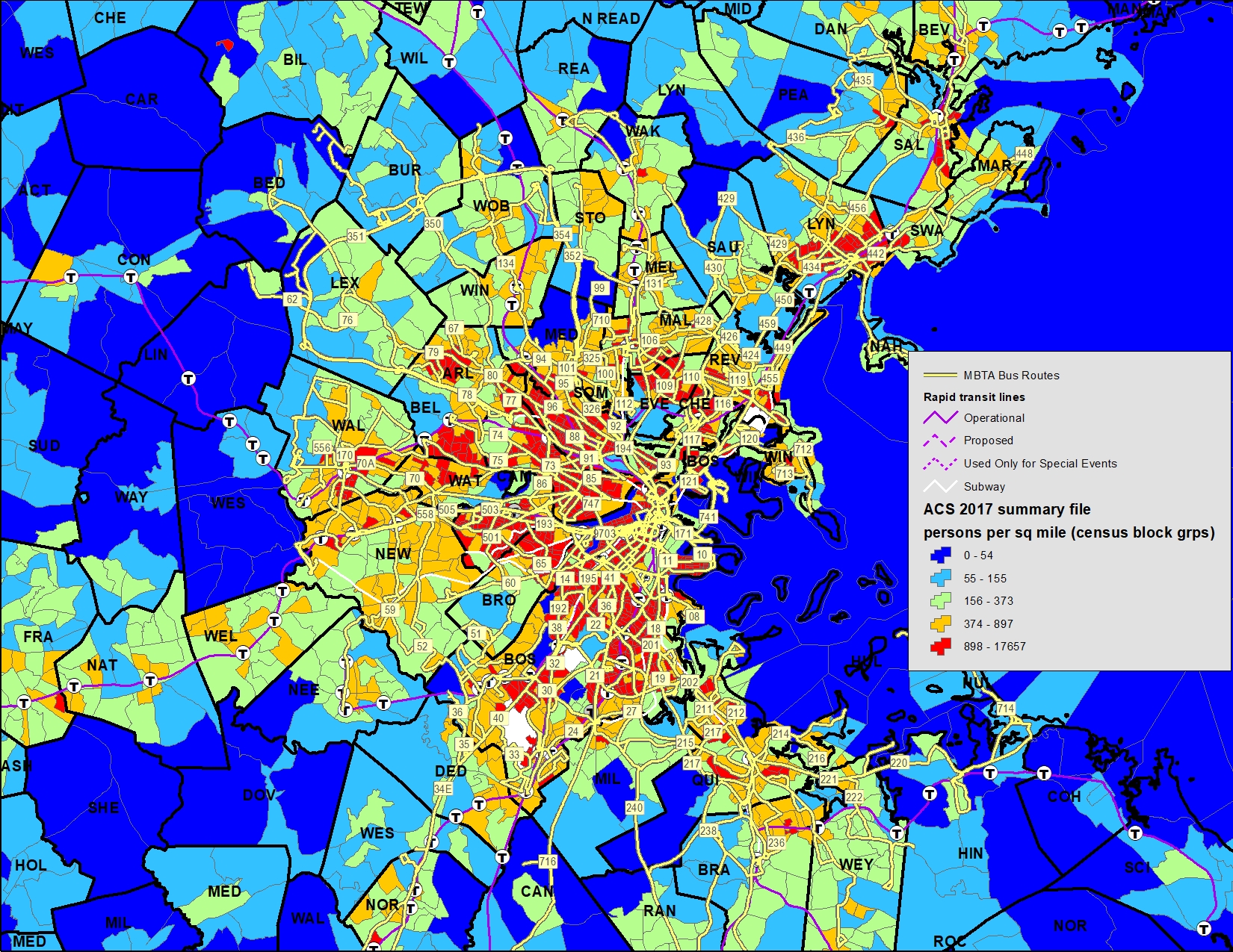
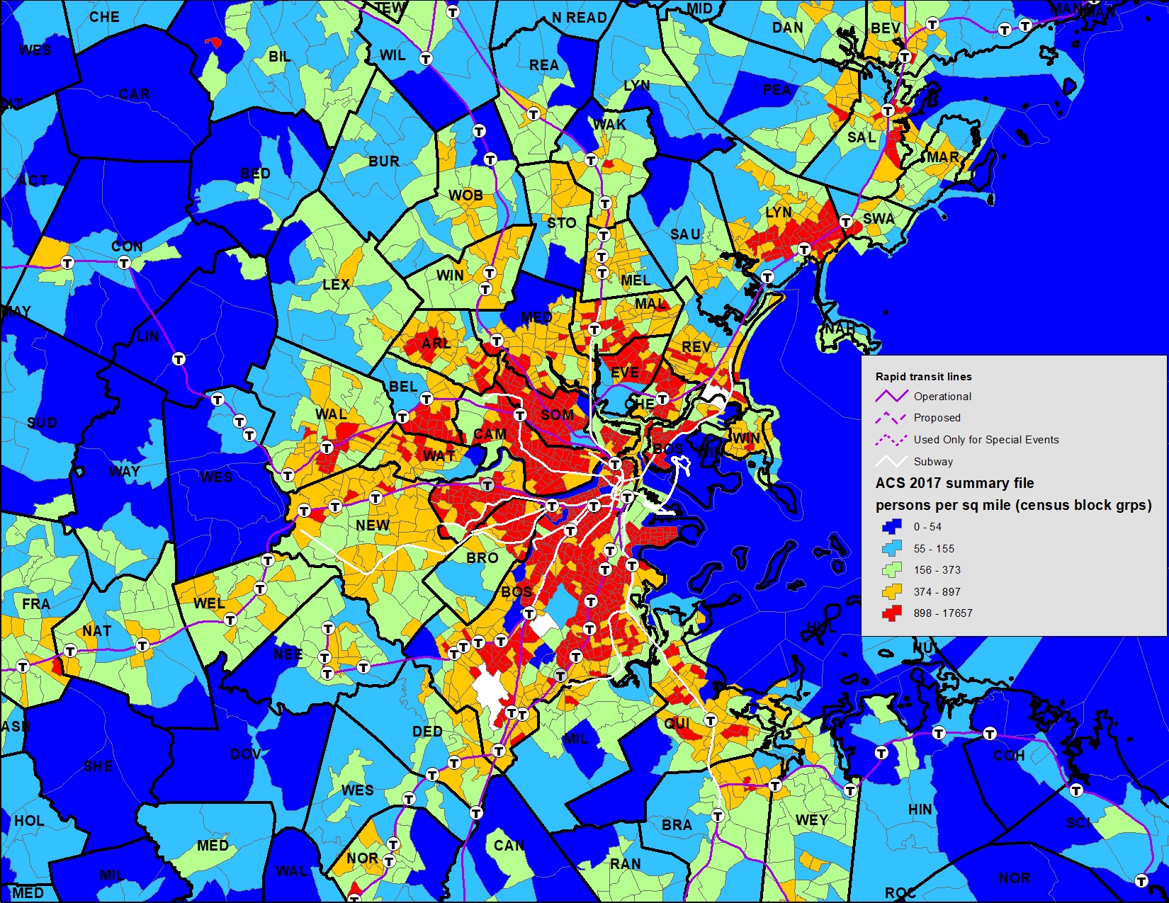
The data in the images above is from the 2010 Decennial Census. Aaron Dushku, former City Councilor in Watertown, assembled data from the 2017 American Community Survey — a more recent census product. He produced the images below. My own read of these images is that they are roughly consistent with the 2010 images in defining highly dense places. Much of the growth over the past few years has occurred in areas of already existing high density.
Comments and explanation from Aaron
The categories are grouped and colored in five quantiles (any set of values of a variate that divide a frequency distribution into equal groups, each containing the same fraction of the total population) considering all of Massachusetts -there’s no magic behind that. So, looking at the red areas alone, we can instantly see density in Watertown and Belmont that is worth comparing to Medford, Revere, Waltham and Newton. If those dense places don’t already have rapid transit, they’re planning it. Then, when you add in the bus network of the second map, there is a conspicuous dearth of any transit lines in the sizable patch of red in these two towns of the Second Suffolk and Middlesex District that is larger than anywhere else in the metro area. Thank God for the 73 and pay close attention to Gordy’s good comment below!
It is also worth noting that we know the big cyan-colored blotch in East Watertown is almost identical in shape to the RMUD (Regional Mixed Use Development) zoning district which will soon change colors thanks to the Arsenal Yards construction underway there (900 housing units!) -as will the light green one in West Watertown where several dense housing developments have been built since the 2010 census and two more are permitted and under construction presently. To this already-red blotch will also soon arrive 112 new residential units of ‘The Bradford’ currently under construction in Cushing Square. We have a very good justification for classifying this part of the region as a ‘Priority Place’.
Thank you for sharing this with your constituents. Still time to send in Focus40 comments, folks! -Aaron D.

Hi Will, thanks for posting the graphics. Just a design consideration, it’s hard to see the red line when it overlaps with dense areas (such as Cambridge) is there a way you could outline it or something so it is more visible?
I redid the climate image — the most confusing — with black lines around the Red Line.
Will, the 20 foot elevation map looks fascinating but gets a low mark for intelligibility. What do all the lines mean?
Sorry! The transit lines are colored as they usually are. The bus lines are in yellow. The 20 foot contour is the black line.
beautiful images- I do similar ones for an arts /research project on Boston ??
Thanks so much for this information.
At a booth at Faire on the Square, I suggested a new route running along Waverly Ave. connecting Watertown 70/70A route to Belmont 73. This would allow Seniors and others who live at 55 Waverly and McSherry Gardens who do not drive to get to/from Star Mkt. and Trapelo Rd. Belmont businesses without relying on taxis.
This route might also loop West on Main to Lexington St going to Warren and back to Waverly providing access to the T for elderly and others who live at 55 Warren.
A questionaire to all those housing units would give usage guidance for the MBTA.
Correct 55 Warren St. to 100 Warren St. [another Senior Moment!!!]
Thanks, Gordy.
This is a really interesting thought. I’m going to make note of it and raise it in the conversation about bus service. The T is really going to try to reexamine their route structure over the next couple of years and this might make sense.
How does the MBTA plan for future growth? Alewife will have many more residents within just a few years, but those residents have yet to show up in the data, as the data is entirely historical. Does the T have a way to forecast new growth, or are all their projections backward looking?
I liked the information on flood zones; I wonder about the Charles River that courses through the “valley” between Nonanturm Rd and Charles River Road. What prevents the river from going to a flood plain in that area should a ocean tide become rambunctious?
Great question. The water level in the lower Charles is controlled by the Charles River dam at its mouth. The big question about sea level rise due to climate change is when that dam will start to be over topped in big storms. Some forecast that for mid century. See this post for more: https://willbrownsberger.com/planning-for-rising-seas-lay-of-the-land/