
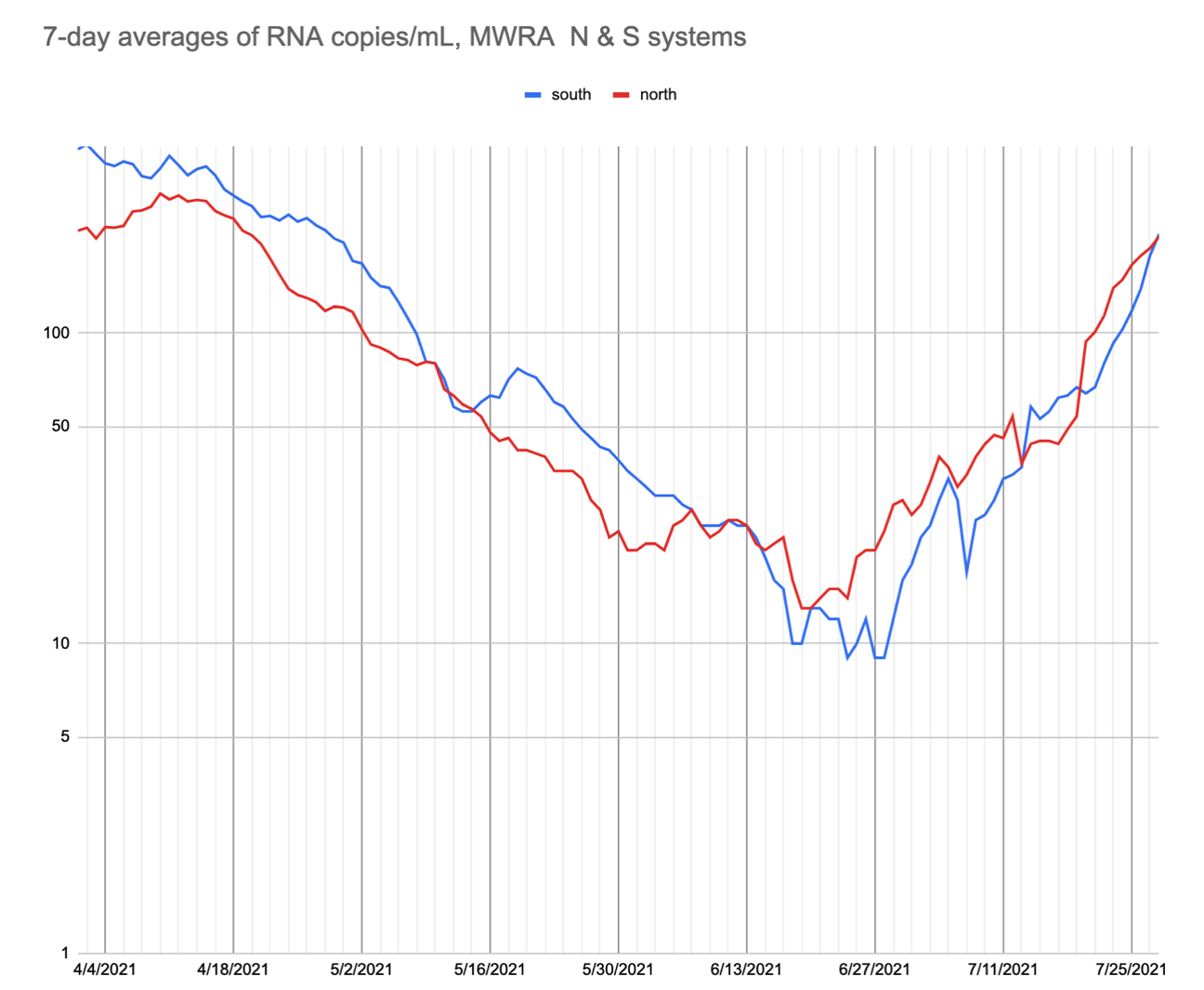
The Massachusetts Water Resources Authority tracks wastewater at the Deer Island Treatment Plant for indicators of COVID-19 infection. A constituent, David Chase, has provided a graph of this information which displays the data in a semi-logarithmic way to demonstrate acceleration and deceleration of spread. You can find this graph below.
Background Information
Studies show that wastewater analysis can be an effective way of measuring community spread of COVID-19. By identifying the number of copies of COVID-19 RNA in a sample, scientists can measure how quickly the virus is spreading in a particular area. One benefit of this method is that everyone in the population is contributing to the wastewater, so there are no issues with under reporting of cases or infected individuals not getting tested. You can read more about this method of COVID-19 surveillance on the Center for Disease Control and Prevention webpage.
Understanding the Graph
This graph displays the 7-day averages of RNA copies per milliliter of wastewater, as collected by the MWRA, in a semi-logarithmic manner. A semi-log graph is useful for displaying data in which there is a change-by-a-factor rate of change. By displaying the data in this way, readers can gain an understanding of the rate at which the virus is spreading as compared to the previous week. Because this is an analysis of all wastewater, it cannot be determined from this graph which percentage of RNA copies are coming from what groups in the community. The RNA could be coming from children who are not yet able to be vaccinated, breakthrough cases from vaccinated individuals, or unvaccinated adults.
To keep up with the latest data, you can visit the spreadsheet provided by David Chase. It is updated 2 to 3 times a week.
To view the raw MWRA data, you can visit their website.
The linear RNA copies/mL was teasing/ hinting at decline after the late June and July rise, but today’s (8/13/2021) update shows a continued climb. Not sure what caused the fluctuation.
Thank you for posting the semilog. That’s nice to see!
It’s great to see David Chase’s spreadsheet. It’s great that it’s annotated with some spread mediation events.
Interested in annotating the weeks prior to the February 2021 to May 2021 plateau in the fall of cases that followed the big November 2020 to January 2021 surge. What caused the surge to stop falling so sharply and plateau?
If I remember right, during the sharp fall in cases in January 2021 authoritative voices were touting the fantastic rate of the drop in cases as a reason for moving forward with reopening, as opposed to absolute numbers. We were hearing messaging of better days ahead, and I’m curious to pin-point the actual restrictions that may have been lifted during this timeframe and how the messaging may have led to looser behavior. During the Feb ‘21 to Apr ‘21 plateau in diminishing numbers 70 to 10 people were dying each week. Was the plateau anthropogenic, or beyond our control?
SARS -CoV-2 RNA in wastewater highest levels at any time during the pandemic per MWRA Covid-19 Wastewater.
RNA Copies/mL
South 1656
North 1112
South 7-day avg. 2144
North 7-day avg. 1230
https://www.mwra.com/biobot/biobotdata.htm
Biobot.io has national Covid-19 wastewater testing data.