The rich are getting richer and poverty is high, even for working age people. What is happening in the middle of the income distribution?
The basic trend — rising inequality and then a leveling off.
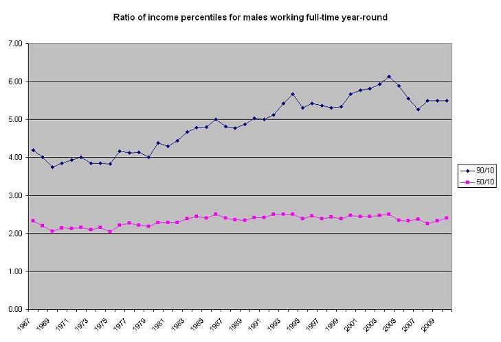
Inequality rose substantially within the 99% of less wealthy Americans over the last few decades, but the trend may have leveled off over the past few years. Those at the 90th percentile pulled away steadily from those at both the 10th percentile and the 50th percentile from the early 70s until the early 2000s, as shown by the rising ratios below. I’ve chosen to show males working full-time year-round to isolate the basic inequality trend from the effects of cyclical unemployment and women entering the work force.
Click here for the spreadsheet underlying this chart and here for the original Census source (refer to IE-2).
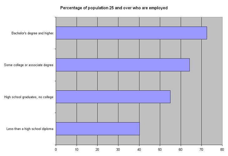
Among those with less education, unemployment (the rate at which people to find jobs) is higher and labor force participation (the rate at which people choose to seek work) is lower, with the net result being much lower rates of employment as percentage of population.
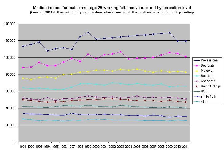
These differences in employment rates appear to be persistent (see table 593 and and table 650). Narrowing the focus to those working, there was increasing inequality of income across education levels, at least until recently. Those with a bachelor’s degree or above saw modestly rising real incomes; those without a bachelor’s degree saw real incomes that were flat or down. Over the last few years, the trend has flattened and college graduates while still at a much higher income level, have not seen continuing gains. Note: These data are not skewed by the more rapidly rising wealth of the 1% — the median incomes, even for the higher education categories in this chart, are all well below the 95th percentile so that accumulating wealth among top earners do not affect them.
Click here for the spreadsheet underlying this chart and here for the original Census source (refer to P24).
The widening difference between the 90th percentile income and the median income was not a direct result of government tax or spending policy — the data reflect pre-tax income and workers at the median do not benefit from the major welfare programs. However, in 2011, the Congressional Budget Office did a landmark study of household level inequality which showed that the equalizing effect of federal taxes and income transfers was less in 2007 than in 1979 — tax rates had dropped for all, but especially for the wealthy, and transfer payments to the non-poor elderly (through Social Security and Medicare) had increased more than transfers to poor households.
The CBO’s focus on households, as opposed to individuals, understates the squeeze on the middle class. In 1970, only 40.5% of married women were working. By 2010, 61.0% were working. Male labor force participation dropped a little during the period, but the total number of workers per couple went up from 1.266 to 1.368, an 8% increase, and the increases were higher for couples of prime working age. So, couples have been working harder as well as experiencing limited income growth.


Comments are closed.